Tuesday, 30 April 2013

DVD cover

\


This is our very own DVD packaging which will we use for distribution purposes. Our aim was to create something eye catching that would stand out among all other films and interest possible suppliers, in order for them to distribute our product.

We used software such as photoshop CS5 and merged images from google images and our own images. We used features that were stereotypical towards a psychological DVD cover, such as the BBFC rated sign, which indicates the rating of the film. The grey/white background that blends with the antagonist's face reflects the meaning of our film title "behind the screen" as the character is displayed to have two different  personalities. In the opening sequence and the DVD cover, we purposely tried to hide the antagonists facial  features to maintain the audiences enigmas.

Here are some famous psychological thrillers that we researched in order to create an aim of what we wanted our DVD to portray. We favored the background blending in with the characters faces on some of these thriller films, thus incorporating it in our DVD cover. We also mirrored the average template of DVD covers because we wanted ours to look professional, for example we analysed different styles of writing basic information on the front cover. We didn't aspire to give away the narrative, as this would not built enigmas and suspense for the audience. However, on our back cover, we plan to describe the plot but again keeping the main purpose of the story line.



Wednesday, 17 April 2013

Practise logo & Final Logo

It was crutial to us as a group that we made our first impression by our logo and connect with our audience. This is our group logo below, that was created via photoshop. We have decided to use the inital WGS, standing for Windsor Girls School, because we're all part of the same group and a team within our school. Before creating our logo we did research on some famous logo's for inspiration and help. We looked at companies like "20th Century Fox" and "Universal". We found that both the companies had unique logo's that stood out to the audience resulting in something the audience will remember. In our logo we have used a camera on a tripod with film tape coming out the side, with the logo name above and under.  We then started by deciding to put a image or background for our logo.

After researching different logo's and ideas we decided to create a camera using clip art. Next, we used photoshop to fill in the camera with colour as before it was plain white. We used the colours of blue to make it more interesting and bold. However, at first we were not certain on the colour of our logo but as a group we decided that blue was the most appealing. This is because, the colour blue gave connotations of the sky and the world. This reflected our ambitions in the media industry. Next, we used the font tool to decide what kind of font is the most suitable. We played around with the layers and positions of the different parts of the logo till we were able to decide on the final positions of all the layers.

As a group, we are proud with our final logo due to the features of the font which looks professional and the iconography standing out, the logo is very eye catching, but not too bold. Our final logo identifies us. Our design is relevant for the business it identifies. This was accomplished through indepth research into the media industry which helps to differentiate from closely associated competitors such as " 20th Century Fox".

This is a picture of our practise logo. As you will notice, we added various iconography which was media related to our final logo. Our team was not confident on the simplicity of the design thus, we felt that we needed something that showed we were a filming production company, which our practise logo failed to achieve. However, we kept the company name of "WGS" in our final production as we favoured this idea. We changed the colouring from green to purple in order to make our logo more professional and memorable. 

Tuesday, 16 April 2013

Producing our soundtrack


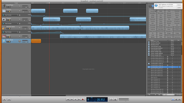
To produce our soundtrack we are using the software "garage band". At first, we found it difficult but after spending time and finding various different sounds, we put together the majority of our soundtrack. Our group slowly added other sounds to fit in with our sequence. We again, tried to portray the distinction between normality and abnormality by having mysterious sounds whilst the antagonist is just getting out of bed. The contrast between the casual day-to-day activities that the antagonist was performing and the eerie music worked effectively  This build enigmas for the public and the contrapuntal elements would make them want to continue to watch our sequence.
We gathered some sounds from Youtube due to garage band not having the suitable sound we had aspired for. In order to use an alarm clock sound at the beginning of our piece, we searched "alarm clock sounds" on youtube and converted this by using Youtube MP3 converter on Google. This changed the youtube film into a file that could be imported into garageband. We then had our appropriate alarm sound we needed.
We then focused on combining different acoustic sounds together to produce a unique and specialized sound that would be controversial to our film footage. We used tools to change the volume and pitch of sounds. This created suspense at our peak points of filming. We recognized how important our sound is in our final production. Considering our sequence is ordinary and normal, we needed a feature that would represent a psychological genre. Therefore, we made our sound a special prop to make the audience feel on edge and suspicious. Our soundtrack took a lot of time and effort to produce, but we are all proud with the final results.