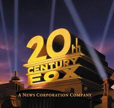
 This is the logo of the 20th century fox which is a very popular film company. The logo is bold and 3D which is very eye-capturing and appealing to the audience. The brassy colour of the font gives connotations of high power. However, because of the other iconography in the logo, the font appears not to be the main focus for the audience. There are animations of strobe lights which indicates the feeling of showtime and production. The font looks like its placed upon a story high building which makes the audience think that the company is American. The dark purple clouds and sky contrasts with the yellow font, making the title stand out for the audience.
The structure of the Universal logo is basic yet unique. It does stands out to the audience as its bold. The name of the company relates to the image used as the earth and space are related to the title "Universal". The title is big and bold which stands out from the background. The use of colour is kept to a minimum, making the logo very realistic and plain. The font is all uppercase and bold with a 3D effect. The iconography of the stars gives connotations of the earth and space, making the company seem professional.
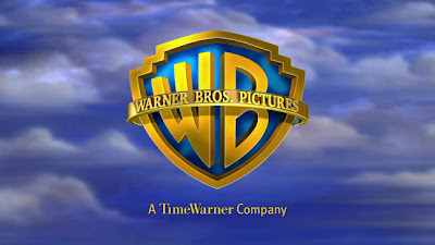
The colours in the logo below are quite bright and therefore eyecatching. The sky background isn’t as bright as the actual logo so this makes the logo stand out more in the eyes of the audience.
The logo is a shield with the initials ‘WB’ for warner bros, inside the shield. Around the outside of the shield are the words ‘Warner Bros. Pictures’ and the background is a cloudy sky. This indicates that Warner Bros are a high up production company with power.
 This logo is quite detailed as there are the initials ‘WB’ inside the shield and then the actual name of the company overlapping the initials and around the shield. Also, there is a background surrounding the shield.
The font inside the shield is different to the font surrounding the shield and the font below the logo. The font inside the shield is quite bold whereas the other font is quite classy and appealing.
In comparing all three logos, there is a big similarity between all. Each logo portrays the idea that they are high up in the sky to symbolise the world and power. All logos also use contrasting colours of yellow and blue or yellow and purple which automatically makes them brighter and bolder. Another similarity, is the 3D font that all three logos use. This makes the font seem more intresting rather then just plain and dull. The only slight difference is the darkness of both the universal and 20th century fox compared to the warner bros.

No comments:
Post a Comment