
Monday, 13 May 2013
Thursday, 2 May 2013
Wednesday, 1 May 2013
Evaluation questions
1. In what ways does your media product use, develop or challenge forms and conventions of real media products?
In order to construct our sequence, our team researched several popular thriller films such as Se7en and Shutter Island to receive inspiration. Our group incorporated the shaky camera movement from The Se7en in our sequence when the camera is used to capture the hostage characters. This idea helped us to create urgency, a feature in our psychological thriller that we wanted to achieve. We used the theme of reality as our film contributes towards the negative impact of social networking sites. The theme of reality was displayed when the stereotypical male reached over to turn his alarm off to begin an ordinary routine. Reality was also used when the male character was rushing in the panic of work which symbolized normality and everyday routines of normal people. However, we then developed this idea by adding muffled sounds of screaming and rustling in the background, whilst the antagonist flicked through images on his computer. This was copied from the real media product of The Sixth Sense. By doing this, we produced enigmas because the public would begin to acknowledge that this may not be just an average male.
A typical sub genre convention is the deceptive games, played by the antagonist, on the protagonists which demolishes the other’s mental state. Our aim was to fulfill this generic convention through creativity in mise-en-scene. By minimizing the amount of clothes the protagonists wore and by using props such as ties in the mouth and rope covering their hands, our media product illustrated this stereotypical convention positively. We then developed this idea by the creation of our “condom wall” which effectively played with the protagonist’s mental state by suggesting they were the next victims. However, by building suspense and beginning our sequence with normality, we challenged other real media products as we counter typically portrayed everything to be casual, before we gave insights to our psychological genre. This is because, most of the thriller opening sequences that our group have analysed have used stereotypical generic conventions right from the start. However, upon analyzing the opening sequence of Inception, by Christian Nolan, we noticed that everything is very contrapuntal and the surroundings are very calm and , in contrast to the suspicious music. This gave us inspiration and an aim to begin our thriller using the same technique of Inception. When receiving our feedback, our aim worked perfectly as students could not find conventions that symbolized our media product to be of a psychological genre. As a consequence, this saved the suspense towards our ending when it came apparent that our media product was a psychological thriller, by the use of our disturbing condom wall and our characters acting.
2. How does your media product represent particular social groups?
By establishing our target audience, our group were able to associate our media product with the social group which would prefer to watch our film. From our primary and secondary data, the largest age group appears to be 15-24 that watch thriller films. This age group was significant to us as we were able to link Facebook and social network sites with this social group. For our mise-en-scene, we used props such as Mac laptops, which is stereotypically associated with this age group as elderly people tend not to be familiar with these devices. We also dressed our female protagonists in stereotypical gender clothing such as padded bras and black pleated tights to connect with this specific social group of females aged 15-24 who tend to be associated with this type of clothing.
Our group also portrayed gender in a stereotypical way. In our media product, you can identify the women in the piece as subordinate to the dominant male character. An example of this is when the camera pans on the females helplessly trying to break free as the commanding and dominating male character has left the room. This represents the roles of men and women today in a wider society. The male is always shown to be assertive whereas the women are shown to be inferior.
3. What kind of media institution might distribute your media product and why?
Our film is not similar to other media products as we have focused on targeting the 8 billion active users of Facebook everyday. Therefore, we have a unique and individual product that could have been produced by major Hollywood studio such as Universal and The 20th Century. It is unique because not many films focus on the negative and dark side of online sites and how it can be a hazard today. Hollywood studios would be interested in producing our film because it not only entertains; it educates the viewers of the potential hazards involved with Facebook.
Media institutions might distribute our product to famous cinemas as with a rating of 15, our product can be distributed to big chained cinemas. With a theme of social networking, our product can also be distributed by digital distribution on websites such as www.Amazon.com. Amazon might want to distribute our product as there target audience is similar to ours and their website attracts the younger generation.
Our media product offers merchandising such as T-shirts and accessories. By merchandising our product, we are able to spread awareness of the dangers online and hopefully gain more protection for users of Facebook. The institution of Facebook could use our product for franchising purposes in concern of anti cyber-bullying or anti phising, thus promoting Facebook as well.
4. Who would be the audience for your media product?
Behind the Screen is targeted at both males and females from mid teens to adults. This is because we rated our film 15 so no one younger than the age of 15 would be able to watch it in the cinema. Also, the plot of Behind the Screen is not necessarily suitable for younger teens and children. This is the reason why children are absent from our target audience.
Before we began filming our opening sequence, we gave out questionnaires to 10 males and 10 females, to establish our target audience. Although it's a small sample, we were able to establish that our target audience consists of more females than males, as males preferred other genres of thrillers than the genre of our opening sequence. From our questionnaire feedback, we also found out that our specific target audience age range is 15 – 65 years.
A film that is similar to ours is American Psycho. This thriller is similar to ours as it is a psychological thriller with the main character being a male containing a psychological problem. The rating for American Psycho is an 18 which is an older rating than ours, at 15. This could be because the content is more extreme than ours, making it unsuitable for under 18’s to watch. Another film similar to ours is Red Dragon. This film is also has the same genre as ours and it appeals to people age 15 and over, much like ours. We researched BBFC in order to acknowledge the criteria fit for a 15. BBFC classified a 15 as able to contain some graphical images, with inappropriate language and some forms of violence.
5. How did you attract/address your audience?
We are aiming our media product at both genders, considering both male and female use Facebook. Our opening sequence would appeal to teenagers and young adults; it may be terrifying for certain people as we have some graphical images within the opening sequence. Some scenes like the pan are not suitable because there are explicit scenes. We have close ups during the pan which are inappropriate and provocative for children to see. We also attracted our target audience when we created our condom wall, included in our mise-en-scene. We made sure the condom wall was saved to the end of our opening sequence to ensure suspense and tension was created. Condoms are an association with the theme of sex which we incorporated in our opening sequence to symbolize young adults and teenagers. This captured and sucked in the audience members, creating enigmas, by portraying a sinister antagonist. We were keen to make our micro elements represent our target audience. For example, the Facebook sound effects used when the door is slamming is associated with the teenage social group because they are constantly activated on social networking sites, even on the go. Our narrative also reflects the target audience as teenagers are associated with social networking sites and communication. There is a shift in representation we used in order to attract the audience. The average young male character getting up for his daily routine actually counter-typically shifts into a rapist, a feature that is not associated with the younger male generation. Our narrative is very modern and current which would appeal to our audience members who have an interest with this crime.
6. What have you learnt about technologies from the process of constructing product?
At first, it was challenging to learn how to use the camera equipment during the filming as we had problems on setting the position of the camera. This was significant to us as we needed to create high angle shots that represented our male character to always be dominant, compared to the female characters. We captured several different angles from high to medium so we could choose the best footage. A common error which was difficult to achieve was the use of lighting as we filmed on different days which affected the continuity. Therefore, as a group we decided to re-film the antagonist leaving the room to improve. We used new equipment such as the tripod for the pan to avoid any shakiness, as our aim was to make it as smooth as possible. Using the tripod was relatively simple. It played a vital role in our opening sequence as it produced smooth and steady shots.
Our group members were unfamiliar with Final cut. This made it time consuming to learn all the different features and software. We learned how to combine clips with transitions such as "fade to black" to flow our opening sequence. We also learned how to speed the duration of individual clips up in order to maintain under our time limit of 2:15.
To produce our sound, we used Garage Band. Here, we learnt how to set the key and tone of the music to create enigmas for the audience. The only negative about Garageband was the limited use of tracks we could use that were appropriate for our sequence. We learnt how to use sites such as blogger and prezi which have been really creative to use. Our group enjoyed the creativity attached to prezi and blogger as this was favored by some members in our group. We learnt how to display our work in an artistic way that was entertaining for the public to see.
7. Looking back to your preliminary task, what do you feel that you have learnt in the progression from it to the full product?
Our preliminary tasks made us feel more confident when filming our full product. From our preliminary video, we were able to establish who is more suited and willing to film or to act. Both team members, Isabele Shen and Olivia developed their ideas and ability to use the camera when practicing the close ups and over the shoulder shots we used in our preliminary.This made our actual filming time for our media product more efficient and effective as both the camera directors were familiar with the technology. Our preliminary video also taught us the basics of Final cut such as the basic transitions and the structure of the clips. This made it easier when building our final opening sequence as our confidence improved the more we used the software.
From our preliminary storyboard, we were able to practice how to construct a storyline that helped us practice our terminology. We were also able to organize the storyline of our preliminary in a way which was logical and that we could refer back to when we were lost. Completing the preliminary storyboard, gave us an insight to creating our main story board for our opening sequence. We knew how valid the story board of our opening sequence was to our team as we were constantly referring back to it for guidance and planning.
From our preliminary evaluation, we learnt how to identify our strengths and weaknesses, and how to communicate our experience via writing. In a way, this helped us to form our actual evaluation as although the questions are different, we are able to answer promptly.
Tuesday, 30 April 2013
DVD cover
 \
\
This is our very own DVD packaging which will we use for distribution purposes. Our aim was to create something eye catching that would stand out among all other films and interest possible suppliers, in order for them to distribute our product.
We used software such as photoshop CS5 and merged images from google images and our own images. We used features that were stereotypical towards a psychological DVD cover, such as the BBFC rated sign, which indicates the rating of the film. The grey/white background that blends with the antagonist's face reflects the meaning of our film title "behind the screen" as the character is displayed to have two different personalities. In the opening sequence and the DVD cover, we purposely tried to hide the antagonists facial features to maintain the audiences enigmas.
Here are some famous psychological thrillers that we researched in order to create an aim of what we wanted our DVD to portray. We favored the background blending in with the characters faces on some of these thriller films, thus incorporating it in our DVD cover. We also mirrored the average template of DVD covers because we wanted ours to look professional, for example we analysed different styles of writing basic information on the front cover. We didn't aspire to give away the narrative, as this would not built enigmas and suspense for the audience. However, on our back cover, we plan to describe the plot but again keeping the main purpose of the story line.


Monday, 22 April 2013
Wednesday, 17 April 2013
Practise logo & Final Logo

It was crutial to us as a group that we made our first impression by our logo and connect with our audience. This is our group logo below, that was created via photoshop. We have decided to use the inital WGS, standing for Windsor Girls School, because we're all part of the same group and a team within our school. Before creating our logo we did research on some famous logo's for inspiration and help. We looked at companies like "20th Century Fox" and "Universal". We found that both the companies had unique logo's that stood out to the audience resulting in something the audience will remember. In our logo we have used a camera on a tripod with film tape coming out the side, with the logo name above and under. We then started by deciding to put a image or background for our logo.
After researching different logo's and ideas we decided to create a camera using clip art. Next, we used photoshop to fill in the camera with colour as before it was plain white. We used the colours of blue to make it more interesting and bold. However, at first we were not certain on the colour of our logo but as a group we decided that blue was the most appealing. This is because, the colour blue gave connotations of the sky and the world. This reflected our ambitions in the media industry. Next, we used the font tool to decide what kind of font is the most suitable. We played around with the layers and positions of the different parts of the logo till we were able to decide on the final positions of all the layers.
As a group, we are proud with our final logo due to the features of the font which looks professional and the iconography standing out, the logo is very eye catching, but not too bold. Our final logo identifies us. Our design is relevant for the business it identifies. This was accomplished through indepth research into the media industry which helps to differentiate from closely associated competitors such as " 20th Century Fox".
 This is a picture of our practise logo. As you will notice, we added various iconography which was media related to our final logo. Our team was not confident on the simplicity of the design thus, we felt that we needed something that showed we were a filming production company, which our practise logo failed to achieve. However, we kept the company name of "WGS" in our final production as we favoured this idea. We changed the colouring from green to purple in order to make our logo more professional and memorable.
 Tuesday, 16 April 2013
Producing our soundtrack
 To produce our soundtrack we are using the software "garage band". At first, we found it difficult but after spending time and finding various different sounds, we put together the majority of our soundtrack. Our group slowly added other sounds to fit in with our sequence. We again, tried to portray the distinction between normality and abnormality by having mysterious sounds whilst the antagonist is just getting out of bed. The contrast between the casual day-to-day activities that the antagonist was performing and the eerie music worked effectively This build enigmas for the public and the contrapuntal elements would make them want to continue to watch our sequence.
We gathered some sounds from Youtube due to garage band not having the suitable sound we had aspired for. In order to use an alarm clock sound at the beginning of our piece, we searched "alarm clock sounds" on youtube and converted this by using Youtube MP3 converter on Google. This changed the youtube film into a file that could be imported into garageband. We then had our appropriate alarm sound we needed.
We then focused on combining different acoustic sounds together to produce a unique and specialized sound that would be controversial to our film footage. We used tools to change the volume and pitch of sounds. This created suspense at our peak points of filming. We recognized how important our sound is in our final production. Considering our sequence is ordinary and normal, we needed a feature that would represent a psychological genre. Therefore, we made our sound a special prop to make the audience feel on edge and suspicious. Our soundtrack took a lot of time and effort to produce, but we are all proud with the final results.
Wednesday, 27 March 2013
Rough cut and feedback
Feedback
1. How well have the technical areas been produced? (camerawork, editing, sound and mise en scene)
2. How well has the genre characteristics been used? Can you identify the sub-genre?
3. What do you like about the rough cut?
4. How can they improve the rough cut? And what criticism can you give the group?
Group 1's feedback
1. The camerawork is good because it is in order. It shows clearly what the man is doing, with each shot. The mise en scene all matches as it is all modern and not mixed with anything that would not correspond with the characteristics of the antagonist. The sound matches the action of the man urinating and the water running, the ambient sound is clear. There is no editing yet.
2. Nothing happens for the viewer to guess what sub genre it is. It just shows a normal guy waking up and using the bathroom, without any concept of a psychological thriller.
3. I like that it is simple and clearly shows what the man is doing, which is good for the viewer to understand.
4. You could add more natural sound in the background instead of it being nothing then suddenly the viewer can hear the man peeing and water being flushed.
Group 2's feedback
1. The beginning of the rough cut is good and the camerawork uses good angles. The mise en scene is also good, especially the costume and the characters stubble. However, the editing is lacking continuity and could be smoother. There are good sound effects in the form of the man peeing, the toilet flushing and the tap running.
2. Not sure yet as to what the sub-genre is because all the rough cut shows is a man participating in his daily routine.
3. We like the different variety of angles used and the shot where the camera follows the man to the bathroom.
4. The error at 0:17, the continuity is a bit off.
Group 3's feedback
Group 4's feedback
Group 3's feedback
- The camera work is good as there are plenty of different shots such as medium and over the shoulder shots. The ambient sound is clear and natural which creates realism. Their is lack of editing such as transitions used which makes the sequence plain.
- At the moment, i cannot identify the sub-genre due to the normal start of the sequence.
- I like the clearness of the ambient sounds as it is engaging and how everything is normal at the start which builds suspense for the ending.
- You can improve the rough cut by adding more details to suggest that this is a psychological thriller. More editing techniques should also be used to make the piece more interesting.
Group 4's feedback
- All four technical areas have been used effectively. However, there are lots of features for camera work yet there is none for editing. All four technical areas should be used consistently and equally. The sound has been used effectively as it creates a surreal feeling.
- We cannot identify the groups sub-genre because no stereotypical features have been used to suggest whether the piece is psychological or action etc.
- We like the continuity of the rough cut as it is smooth without any mistakes. We also like the character as we think his appearance resembles a rapist.
- Add some features of a psychological thriller so the genre is clear and not mistaken for another genre. Also speed up the duration because it is quite boring and takes a while to get to the point.
Wednesday, 20 March 2013
Character profile
Since we decided the storyline of our opening sequence, we had different discussions about the details of our main character.
For us, it was very important to make our character look like a normal person for most of the opening sequence and not like an antagonist because it would create an enigma within the audience. The audience would be confused as to why the character was included in the opening sequence until the end of the sequence, when it is revealed that although he may look normal, he isn’t.

Our antagonist will be wearing a shirt and tie for the second half of the opening sequence, making him look like a stereotypical male going to work. These clothes are countertypical for antagonists to wear in thriller movies. They also aren’t the sort of cloths you would expect a character with psychological issues to be wearing either, creating further enigmas.
Until he goes on his laptop and onto Facebook, our character looks normal and there is no reference to him being an antagonist with psychological issues at all. However, when he leaves the room, it becomes clear to the audience that he is a rapist as they can see the strange things that he has collected in his room. These things include bras, knickers, high heels and condoms and they are scattered all over the floor. There also three girls, two of which are tied up and one is unconscious, lying across the floor and a sofa. This shows that he isn’t psychologically normal, as he has kidnapped three girls and has brutally raped them, and relates to the theme of our thriller.
 We have decided that the main character’s room will be displayed with lots of laptops and electronic equipment to give our audience the first indication to his normality because it’s unusual to see more then one computer or laptop in a person’s room. This also represents that he is using social networking for searching female as his next target.
To show what we wanted our main character to be like, we designed our own main character. The picture that one of our group members drew shows that our character will have messy hair and be dressed in smart clothing. We also used different images from the internet to show the different objects that will be displayed in his room.
Tuesday, 19 March 2013
Possible title effects
Our team wanted our titles and credit of our opening sequence to be exclusive and unique. In order to achieve this, we searched the Internet for possible title effects. Here are a few examples that our team preferred.
 This first title effect to the right symbolises the urban feel to our film. Considering phishing is quite a modern feature with the 21st century that occurs in most urban cities, our aim was to built something
current and modernistic. The font is bold and thick which is more appealing for the viewersw. The only negative about this font is the way the title does not represent a psychological thriller as the title is not spooky or scary.
 The second title effect, is quite plain but it represents abuse with the slightly worn out and crumpled tones of the letters. The sophistication and boldness is toned down by the use of lower cases, in comparison with the bold one above.
 The third title effect is quite similar to the second, but more eye catching with more disstored letters. The splatter of the letters creates a messy feel which corresponds with the bedroom of the antagonitst.
Wednesday, 13 March 2013
Practise test shot in bathroom
This is a practice shot in the bathroom of the antagonist casually cleaning his teeth. We used an over the shoulder shot to film this. Firstly, we recorded the sound of a tap running in order to capture the sound with clarity. We then recorded the actual clip of the antagonist cleaning his teeth. On GarageBand, Frankie then deleted the natural sounding of the clip, and replaced it with the sound of the tap running.
The sound is now clear making the audience feel involved and engaged with the clip due to the effect of realism that has been created with GarageBand.
Tuesday, 12 March 2013
Location report
 Previously, we had many ideas of location. Initially, we had the aim to film inside school during school hours because the timing meant our group could all participate without practical issues and the school also had the majority of the equipment we needed to film. Because our opening sequence reveals different electronic devices, we thought of filming in the Windsor Girls IT suite as there were plenty of computers, PCs and headphones there that we could borrow for prop. However, due to the issue of the busy environment and the fact that we needed the antagonist to wake up in his house, we decided to ignore that idea as our continuity would have been poor when trying to create the feeling that we have used just one location to film. Our team member, Thuraya, quickly stepped in and nominated her cousins bedroom, considering he was our antagonist. Everybody was comfortable with this decision as the location was relatively near and we had all the facilities from computers to beds in Thurayas cousins bedroom.
When we arrived in the bedroom, the location was perfect. The setting of an ordinary 21year old room related well to our plot of the story. The contrast between normality and insanity was a feature we wanted to achieve as we felt it was unusual and peculiar because the stereotypical antagonist in a psychological thriller is supposed to behave inhuman. Therefore, by making our antagonist act as normal as possible in a normal environment, the plot will be counter typical and different from other thrillers. In the location, there were several posters, of which we wanted to keep, and a messy desk space that contributed well with the average males room. The modernity of the room also worked well with our plot as Facebook is a modernised concept in the 21st century. There were two sofas which was useful as it made the bedroom look like an appartment enviroment, this added realism. The bedroom also had an ensuite, making it perfect for our bathroom scenes. The bathroom had a shower, sink and cabinets.
 There were some issues in the location, which were also identified in the risk assessment sheet. Our team had to work well to prevent any lighting errors as the bedroom was located at the highest point of the house where the natural lighting of the sun kept shining in. We returned several times to our location in order to re-film and add in shots that were not initally planned. The nearness of our location made it quick and easy for us to go back and re-film. For example, we filmed several shots of the antagonist communicating over a Facebook message with his protagonist. By sticking to one main location, we were able to repeat our mistakes and keep the continuity of the film.
The location has televisions and space to put all our wanted electronic devices such as three laptops and a telephone. We wanted our antagonist to be stereotypically technical with computers as this is what people associate with phishing. The messy and unorganized living space is a stereotypical feature associated with young adult males. Our use of props resembled our modern narrative because we used Mac laptops, which are current for today.

Practise of sound on GargageBand
In order to create this sound, I used GarageBand. At first, I was inexperienced with the new software, but from the help of others, I quickly grasped the concept of GarageBand. Taking into account our psychological genre, my intention was to compose a mysterious and creepy sound that was parallel to our opening sequence. I listened to many acoustics and piano sounds because I wanted to achieve quite a suspicious non-diagetic background track for our opening sequence. After deliberating with different instrumentals, I was able to mix three sounds together found in the Mysterious and Intense section. I was taught how to fade in and out the sound to create the gradual flow of the track. I was also taught how to soften sounds so that they were not so loud.
Although this is just a practise copy, I feel that this track could play a major part in our opening sequence. The reason being is that the sound creates the illusion I wanted and it relates well with the antagonists characteristics of secretive and sly. Its suspicious and builds up the pace which goes with the slow duration of our opening sequence. It also creates enigmas for the audience as the public will wonder why the music is intense when the antagonist is just brushing his teeth or getting out of bed. During the later stages of editing, I hope to add a number of diegetic sounds to the background music from girls screaming to the doors locking. We have recorded each diegetic sound we are going to use, in order to achieve clarity and definition. This will be added in our final piece to create suspsense and uncertainity.
Monday, 11 March 2013
Production logo ideas
As a team, we wanted to form a professional and smart logo that related well with our psychological genre. We began by researching other popular production companies to receive aspiration and ideas. To the left is a mood board of pictures that we researched in order to grasp some sort of concept as to what our logo could initialise. All logos use many dark colours which forms the genre of the thriller films. Some use tones of red to associate their films with blood and evil. Others use black to create a suspicious and gloomy emotion for the audience.
After comparing and contrasting lots of different possible logos, we brainstormed all our ideas and decided on possible titles and iconography. Our team used the above logos to influence our ideas. There were several disagreements on using our first name initials for our logo due to the fact that this was done by many other media students and we wanted something unique and different. One possible idea for our production logo was to use the initials of our school WGS (Windsor Girls School) with their logo of Aspire Advance Achieve. Due to the issue that this does not correspond or relate to the plot of the story as planned, we are still not final on this logo idea. However, we have still created a video as to what this idea may look like. The logo is neat and professional which represents who we are and where we come from.
Unfortunately, we were not allowed to use the Windsor Girls logo because this was copyright. Therefore, we adapted our initial ideas to form a logo with just the Windsor Girls School initials.
Unfortunately, we were not allowed to use the Windsor Girls logo because this was copyright. Therefore, we adapted our initial ideas to form a logo with just the Windsor Girls School initials.
Thursday, 7 March 2013
Production logo analysis
 This is the logo of the 20th century fox which is a very popular film company. The logo is bold and 3D which is very eye-capturing and appealing to the audience. The brassy colour of the font gives connotations of high power. However, because of the other iconography in the logo, the font appears not to be the main focus for the audience. There are animations of strobe lights which indicates the feeling of showtime and production. The font looks like its placed upon a story high building which makes the audience think that the company is American. The dark purple clouds and sky contrasts with the yellow font, making the title stand out for the audience.
The structure of the Universal logo is basic yet unique. It does stands out to the audience as its bold. The name of the company relates to the image used as the earth and space are related to the title "Universal". The title is big and bold which stands out from the background. The use of colour is kept to a minimum, making the logo very realistic and plain. The font is all uppercase and bold with a 3D effect. The iconography of the stars gives connotations of the earth and space, making the company seem professional.
The colours in the logo below are quite bright and therefore eyecatching. The sky background isn’t as bright as the actual logo so this makes the logo stand out more in the eyes of the audience.
The logo is a shield with the initials ‘WB’ for warner bros, inside the shield. Around the outside of the shield are the words ‘Warner Bros. Pictures’ and the background is a cloudy sky. This indicates that Warner Bros are a high up production company with power.
 This logo is quite detailed as there are the initials ‘WB’ inside the shield and then the actual name of the company overlapping the initials and around the shield. Also, there is a background surrounding the shield.
The font inside the shield is different to the font surrounding the shield and the font below the logo. The font inside the shield is quite bold whereas the other font is quite classy and appealing.
In comparing all three logos, there is a big similarity between all. Each logo portrays the idea that they are high up in the sky to symbolise the world and power. All logos also use contrasting colours of yellow and blue or yellow and purple which automatically makes them brighter and bolder. Another similarity, is the 3D font that all three logos use. This makes the font seem more intresting rather then just plain and dull. The only slight difference is the darkness of both the universal and 20th century fox compared to the warner bros.
Wednesday, 6 March 2013

Risk Assessment sheet

This is our risk assessment sheet that indicates all the possible potential risks and hazards that could or has occurred during filming.
Tuesday, 5 March 2013
Shot List
Here is a schedule of our shot list that we will try to follow in ascending order when filming our peice. In the info box, we have tried to include all our props we will be using such an an alarm clock and electronic devices.


Analysis of sound in Vertigo and the Girl with the Dragon Tattoo
We analysed the sound in the opening sequence of the 1958 psychological thriller, Vertigo. At the beginning of the opening sequence, we can see close up shots of a character’s facial features such as lips and eyes. The music is quiet at the beginning and gradually gets louder and when the first title ‘James Stewart’ comes up at 0:08, we can hear a loud brass instrument. After this, whenever a title comes up, brass and violin sounds can be heard. A xylophone and harp can also be heard being played in the background lightly, throughout the close ups of the character. The sound in the first part of the opening sequence matches the camerawork as close up shots are used on the persons face. We would think that the close ups were a bit strange if there was no music but with the music included, the close ups make the audience feel as if something isn’t right.
 At 0:44, we can see a spiral in the characters eye and as the spiral gets nearer, the non diegetic sound gets louder. In this part of the opening sequence, the sounds are more continuous as instruments such as a violin aren’t just played for a short amount of time, like they were in the first part of the sequence. The diegetic sound in this part of the opening sequence is parallel to what is happening on the screen because there are spirals on the screen which are quite strange and hypnotic and the diegetic music being played sounds strange and weird and not like music that you would usually hear. Throughout the majority of this part of the opening sequence, a violin can be heard but after about 35 seconds, we can hear the xylophone and the brass instrument come back in. Towards the end of this opening sequence, the violin gradually comes back in and all of the instruments used to create these sounds are heard at the end of the sequence, when we can see the characters eye once again. The last sound we hear is a brass instrument, possibly a trombone, as it sounds very low and deep.
The instruments used in this opening sequence fitted well with the opening sequence as the sound of the violin and the brass instrument created a dangerous feeling. The xylophone and the harp sounds created a calm feeling so when all of these instruments were used together, the 2 different feelings created an mysterious atmosphere and confused the audience as they were unsure of what was going to happen.
We also analysed the sound during the opening sequence of
the 2011 crime thriller, The Girl With The Dragon Tattoo. The track that can be
heard in the opening sequence is a cover of the 1970 hit ‘Immigrant Song’ by
Led Zeppelin. Throughout the opening sequence, the main sound we can hear is a
drum beat.
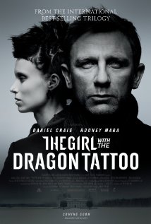 When the opening sequence starts, we can hear a build up of
music, before hearing drum beats which start at 0:05. The drum beats are very
fast and have a repetitive rhythm so they catch the audience’s attention. The
drum beats are parallel to the opening sequence because they give the sequence
a sense of action and in the opening sequence short shot duration was used.
This makes the opening sequence parallel to the sound because usually in action
scenes, short shot duration is used to make the scenes snappy.
When the opening sequence starts, we can hear a build up of
music, before hearing drum beats which start at 0:05. The drum beats are very
fast and have a repetitive rhythm so they catch the audience’s attention. The
drum beats are parallel to the opening sequence because they give the sequence
a sense of action and in the opening sequence short shot duration was used.
This makes the opening sequence parallel to the sound because usually in action
scenes, short shot duration is used to make the scenes snappy.
The drum beats are the only sounds we can hear, until 0:13, when
we can hear another sound, possibly an electric guitar. This sound sounds like
an alarm which relates to the theme of the film because in crime thrillers,
there are usually bad things that happen. At 0:21, we can hear a voice which sounds
like a woman’s voice. This suggests that there could be a main female character
in the film and this is also suggested in the title.
After 0:21, the person’s voice can be heard regularly, as
the song ‘Immigrant Song’ has passed its introduction. This song is a rock song
and we can tell this from the instruments that are used such as drums and
possibly an electric guitar and also by the way that the singer is singing. The
rock song is parallel to the theme as thrillers are meant to be scary and the
way that the person is singing sounds like they’re shouting so it fits with the
thriller theme. Towards the end of the opening sequence, at around 2:11, the
sounds and the singing start to get louder as it reaches its climax. At 2:24
the singing comes to an abrupt end and we can hear the electric guitar playing
out quietly as both the song and opening sequence come to an end.
The music in this opening sequence worked well with the
sequence itself because during the sequence, the visuals were quite strange and
scary such as a person’s face being tied up towards the end of the sequence.
Because the song was rock, it has a scary vibe to it so fitted with the
sequence whereas if the music was peaceful or was a different genre such as
pop, then it wouldn’t have fitted.
Both of these opening sequences have similarities. Both of
these openings have a sound that can be heard suddenly. In Vertigo, the sudden
sound is the brass sound and in the Girl with the Dragon Tattoo, the sudden
sound is the singer shouting. Parts of the melody in Vertigo are repetitive as
are some parts of the melody in the Girl with the Dragon Tattoo. However, these
opening sequences have differences as well. The sound in the Girl with the
Dragon Tattoo is completely different to the sound in Vertigo as the genre of
the music is rock whereas the genre of the sound in Vertigo is classical. The music
in the Girl with the Dragon Tattoo is modern whereas in the opening of Vertigo,
the music is quite traditional. Also, there are only instruments being played
in Vertigo whereas there’s music and singing can be heard in the opening of the
Girl with the Dragon Tattoo.


Creating the mise-en-scene
 To begin with, our team members all worked together to make the mise-en-scene as effective as we could. We originally had the idea to hang condoms from the wall of the antagonist with Facebook profile pictures to indicate self content of rape and abuse. Our team spend time to clean the lubricated condoms before blue-taccing them to the wall. To the left is a picture of us cleaning the condoms and arranging them in descending order.
 We then stuck each individual condom on the wall and placed a profile picture on top. We used girls facebook profile pictures that we knew and some we didn't to get a variety of different ethnics and ages. We used four lines with roughly 100 girls photos and 100 condoms. This is the final product with all pictures displayed ready for filming.

 Costume was very important to us as we wanted to make it clear to the audience that the characters had been abused and raped. Our original plan was to use the professional make-up artist Ellie Nutt. However, due to availability our own team member stepped in (Isabel Shen) to do Frankie and Thuraya's make up. To the left is a picture of Frankies makeup being done. Although we didnt have a professional make-up artist as desired, we were still able to create an effective and realistic look for our characters. At the left and to the bottom, is the final piece. Black eyeshadow was used underneath the eyes and chin to express a drained look. Red lipstick was used under the nose and on the shoulder to make enigmas for the audience. Smeared red lipstick was used on the left character in order to
illustrate the struggle and force the character was under.

Our initial ideas was to use three or four girls to act. However, this came across too unrealistic, especially because the rapist was supposed to be portrayed as sly and secretive. Therefore, we used three girls tied up instead. Frankie and Thuraya wore minimal clothing with visible bra straps to show signals of rape and sexual activities. Thuraya showed her stomach whilst Frankie showed her chest, this meant the contrast between the clothing created enigmas for the audience, a feature we wanted to achieve. In order to create realism, we scuffed all female characters hair to portray a rough and unmemorable night of the stay with the antagonist. The tights have been ripped to give enigmas of violence and rape. We wanted to achieve three characters that represented rape and looked distressed. As a group, we feel like we achieved this very well considering our limited equipment of make up and costume. We worked well together by listening to our teams ideas and combining them together to create an all in all great mise-en-scene.

Our next task when regarding the mise-en-scene was the lighting. Lighting was a key factor in our opening sequence as it represented the characteristics of the antagonist. In order to achieve this, we shut the curtains and blinds to prevent natural lighting in our camera. This prevented any mise-en-scene errors. We switched all main lights of during the stage where our anagonist is sleeping. We done this to make the start of our opening sequence seem as normal and ordinary as possible. We then used high-key lighting in the bathroom to express the normality of the situation to correspond with the character brushing his teeth.
Wednesday, 27 February 2013
Target audience profile
 Our group decided to collect both primary and secondary data in order to obtain reliability and a true picture of our target audience. The primary research included a set of questions structured in a questionnaire. Using this primary method, it gave us a chance to capture the truth from our audience as all questions were the same we could generalise accurate results from our data. We asked questions like age and gender in order to see if preferences in films relied on these factors. We then selected 10 girls and 10 boys with differences in ages to complete our questionnaires and return them back. We asked our target audience their favourite thriller films to see if people had favourites. From our questionnaires, we can conclude that our target audience ranged from 15-65. We also realised that males tend to enjoy more crime films then psychologicial films. This may be because boys tend to associate more with crime. Considering that our film has the genre of a psychological thriller, we now have an aim to focus on getting males interested in actually watching our opening sequence and capturing their attention. We can also include from the occupation question, that those with higher annual salarys tend to watch thriller movies more often in a week then those with lower annual salarys. This may be for practical reasons however, it is still one aim of ours to create a non-biased opening sequence for both people with higher and lower annual salarys.
We then used secondary data via the Internet on the website of http://business.pearlanddean.com/audience_profile to gather existing data about the different ages, sexes and gender etc that watch thriller films. We researched the crime film of Tower Heist to inform us about the different ages, gender and class that watch this specific film.

We compared the results of Tower Heist crime film to that of a psychological film of Shutter Island. We found (by a small percentage) that more males preffered crime films as shown in our primary data. However, because that statistics are so small, we will still be targeting males and females for our film.
The largest age group that watched both crime and psychological films were aged between 15-24. Their was a small minority who were elder that watched either crime or psychological which we also found out in our questionnaires.
 From establishing our target audience we are now confident with who we will aim to entertain. The use of our primary and secondary data really helped our group discover the trends and made us realise how factors such as class, gender and age all have an influence to preferences and time spent watching thriller films. From our data we can now conclude that males watch more crime films then females and that the largest age group appears to be 15-24. This works well with our film, as the antagonist is at the age of 12 which fits into the gap of those who watch thriller films the most. Hopefully, by the use younger characters we will attract that younger generation as they are the ones who seem to spend more of their time watching films.
From both our primary and secondary research, we were able to come up with a suitable mood board for our target audience. Seeing that the most popular age was between the age of 15 and 24, we have created a mood board for a male and female that represents the life of someone aged 15 to 25. The mood board consists of various objects that we associate people between the age of 15-25.
Subscribe to:
Comments (Atom)